Pivotal Tracker Pricing
Problem Space
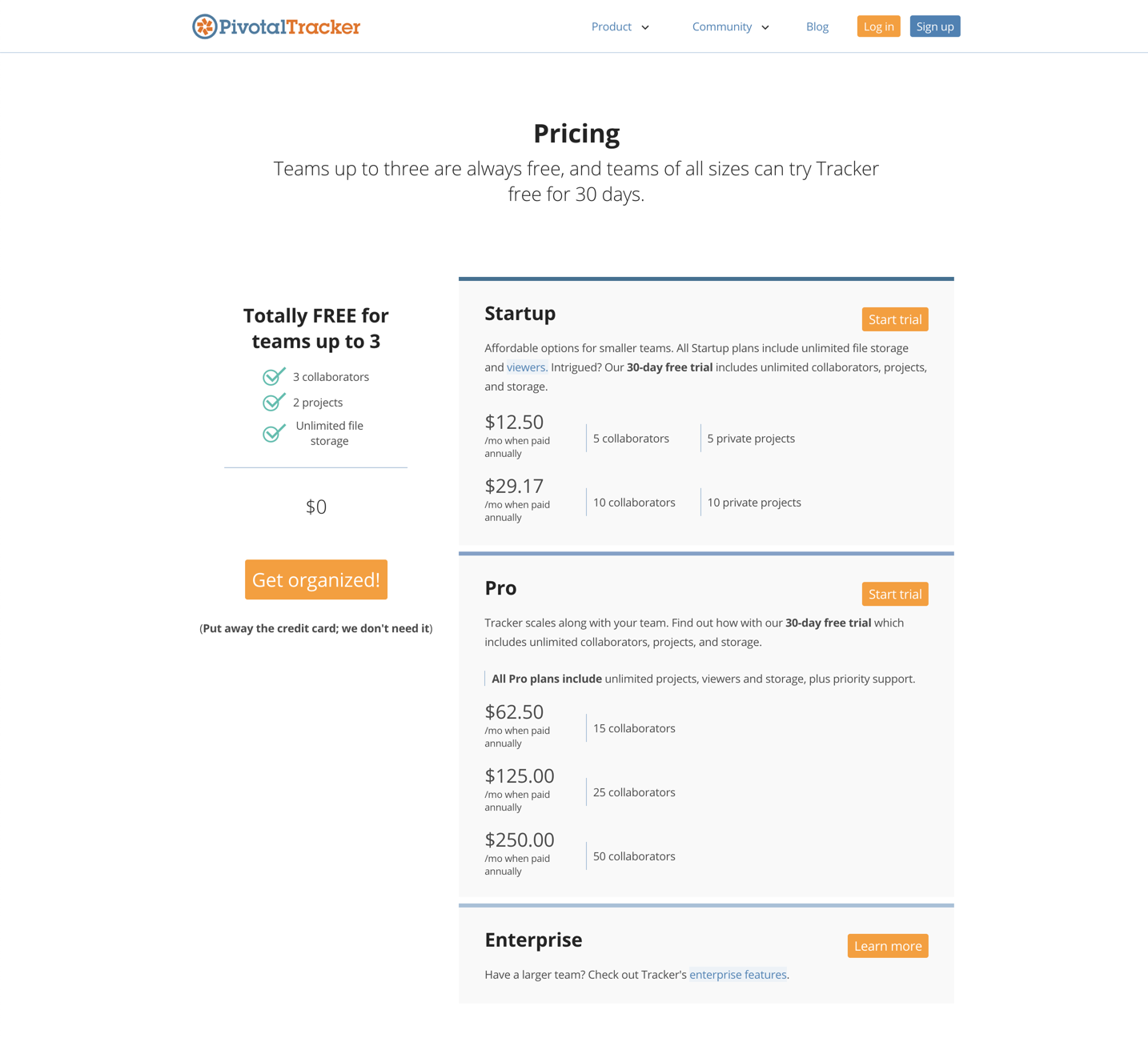
Pivotal Tracker was experiencing customer attrition due to an outdated pricing model that was punitive to users who wanted to add additional collaborators. The model was based upon large tiers in which small to mid-sized teams were forced to pay for an additional 5-25 collaborators when they only needed to add one or two.
We were receiving downgrade feedback on a weekly basis from customers who were leaving specifically due to pricing. With remaining customers, our Customer Support team was inundated with requests to have bespoke pricing so they could add one or two collaborators.
“I was wondering if there is a way to add a few additional users instead
of doubling up what i'm paying monthly. Right now we are on the 150 plan and are looking at 100% increase to add ONE new staff to the account as a collaborator. Please do share as we are going to need to add a new user asap.”
Because of this, we were suffering revenue loss. Additionally, we were creating a poor user experience by preventing teams from focusing on what they care about, which is building product.
Research
Analytics & Modeling
I started this work by trying to understand the upper and lower bounds for our new pricing. The goal was to find an equilibrium between providing a better customer experience and protecting (and growing) revenue.
By analyzing our current pricing model, I was able to draw a line of best fit, and layer in two additional types of data:
Prospective models that I would later test
Models from competitors. It was critical to understand how competitors structure, price, and represent their pricing models, because prospective customers will not only be looking at our product, but will be comparing it against others in the market.
User Research
Once we had a better grasp on the upper and lower bounds we could implement, I needed to understand:
how to structure the new pricing, and
what users were willing to pay (to compare with the upper and lower bounds).
To understand the first question, I concept-tested wireframes of the models I had graphed out. This included: different versions of the pricing structure, such as per user versus small bundles, and different versions of the pricing approaches, such as pricing based on collaborator seats versus feature sets.
To understand the second question, I sent out a survey to determine how much wiggle room we had in the price-point so we could gain optimal revenue. Tangentially, I also wanted to have a better grasp on what copy would most attract prospective customers. The survey ran for one week and yielded 37 results.
To understand the context of the results, I matched the responses with the number of collaborators in the respondent’s account. After all, a user who says $4 is a good deal for Tracker, but has 275 collaborators on their plan, means something different from another user who says $7 is a good deal, but only has 50 collaborators on their plan.
Decisions
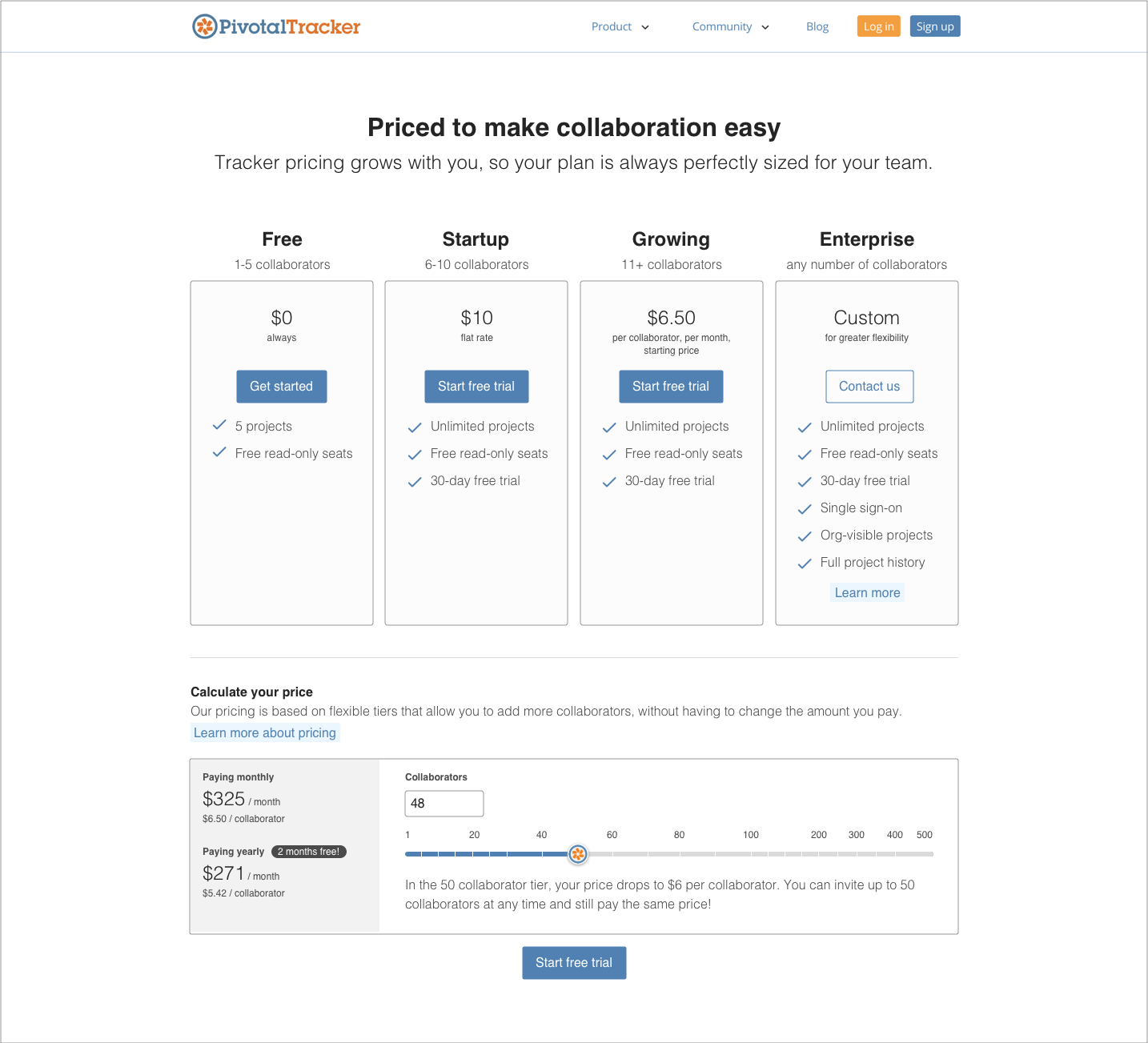
We moved forward with a pricing model based upon small bundles of collaborator seats, with a free, startup, standard, and enterprise plan. We chose small bundles instead of per-user pricing, because:
it was still industry standard, while being a much lower technical effort,
it was easier for (non-admin) team members to add additional collaborators within their bundle, and
users appreciated having a bill that didn’t dramatically differ from month-to-month as they added or removed collaborators.
Designs
Marketing Page Flow
The marketing pages serve prospective customers, so this set of designs had the following goals:
Simplify the experience and draw attention to CTAs
Make comparing plans more intuitive
Raise prominence of enterprise option
Reflect the design aesthetic and structure of the rest of the website (in Jekyll)
With feedback from users, the Customer Support team, and leadership, I iterated over several different versions of the designs.


Current Customer Flow
For current customers, we needed to create an easy way to increase or decrease their collaborator seats, along with clear confirmations of changes. There were several gaps in the existing experience that make the flow disjointed and confusing. I started by mapping out the journey and then designed a simple flow to meet customer needs.
Timely considerations
I was working on these designs just as the COVID-19 pandemic was breaking out. Our team wanted to do something to help, so we offered free sponsored plans to people who needed to use a product management tool to organize their efforts. To this end, I created a few illustrations and a banner to promote the free plan.
Measuring Impact
We are currently measuring impact by tracking revenue, attrition, help ticket count, and marketing page conversion.

